











The Riverbend Project
Brand, website, and five years of campaign work for a Jackson Hole cancer-retreat nonprofit.
Brand Identity
Brand Identity · Logo System · Brand Guidelines- Client
- The Riverbend Project (501(c)(3))
- Mission
- Free fly-fishing retreats for living life beyond cancer
- Deliverables
- Logo system (2 generations) · brand guidelines · palette · type · technique guide
- Symbolism
- Tetons + Snake River in a circular frame · cutthroat trout (resilience)
The Challenge
The Riverbend Project needed an identity equal to its mission — a 501(c)(3) founded to connect people impacted by a cancer diagnosis to the healing of guided fly fishing on the Snake River in Jackson Hole. The founder started it in memory of his younger sister, Grace, who through a battle with Stage IV metastatic melanoma used the outdoors as a source of therapy. The brand had to carry that weight with warmth, not sentimentality.
The Approach
A documented identity built around place and meaning: the Grand Tetons and the Snake River held in a circular frame, with the cutthroat trout as a symbol of resilience. A four-colour palette with a stated symbolic rationale, a Carolina Mountains and Raleway type pairing, a technique guide, and applied mockups — carried across two logo generations from 2021 through a 2024 refresh.
The Outcome
A cohesive, meaningful brand the organization has carried for years across its site, its print, and its retreats.
Website Design, Build & Ongoing Management
Web Design & Development · Donorbox Integration · CMS Management- Scope
- 5-page responsive nonprofit site
- Integration
- Donorbox (wired to the org bank account)
- Management
- Dedicated monthly CMS retainer (since launch) · 2024 refresh
- Reporting
- Monthly plain-language analytics + metric glossary for the board
The Challenge
The site had one job: move visitors toward the two things the mission depends on — donating, and signing up for a retreat.
The Approach
A five-page responsive nonprofit site (Home, About Us, The Project, Donations, Get Involved), with templates designed to pull people toward donations and program sign-ups. We wired a Donorbox integration to the organization’s bank account, built the Terms and forms with automations, connected the client-purchased domain, ran a live beta bug pass, and handed over the CMS with training. Immediately after launch it moved to a dedicated monthly CMS-management retainer — and was refreshed again in 2024.
The Outcome
A live, self-sustaining nonprofit site the organization runs with our ongoing support. We report on it monthly in plain language, with a metric glossary written for a volunteer board — the kind of reporting discipline that keeps a small nonprofit’s digital program legible to the people governing it.
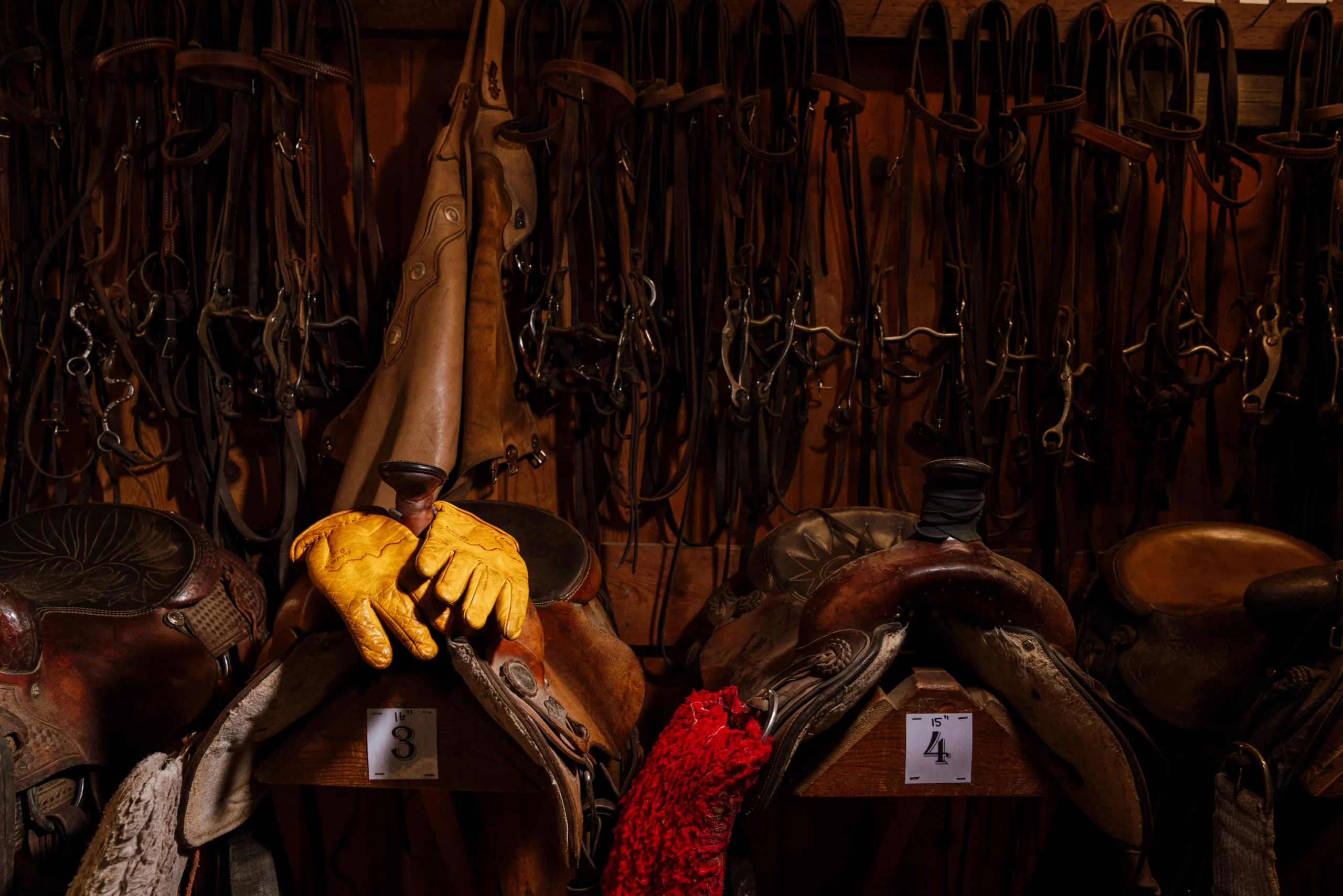
Retreat Campaign & Collateral Program
Print & Campaign Design · Email · Photography- Program
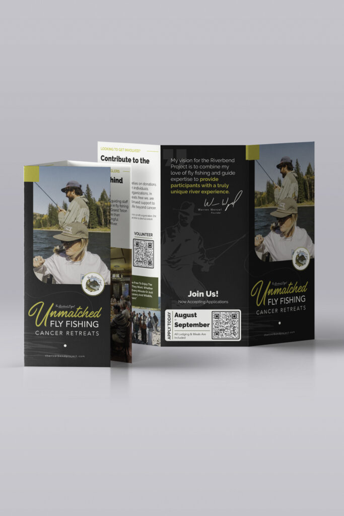
- 3 brochure generations · flyer · applications · donation flowcode · email sequences · newsletter
- Span
- 2022 → 2026 (five seasons)
- Photography
- Season retreat photography
The Challenge
Beyond the site, the retreats themselves needed a campaign — materials to invite participants, raise funds, and carry the story season after season.
The Approach
A multi-year collateral program: three brochure generations, an info flyer, participant applications, a donation flowcode, retreat and post-retreat email sequences, a participant newsletter, and season photography — evolving across 2022 through 2026.
The Outcome
Five consecutive years of a retained client relationship, and a campaign system the organization runs each retreat season.